7.01.2011

Signs: Don't ignore the tried and true in marketing business

A great article with ideas for marketing through signage!
-----------------------------------------------------------------
Social media. Search engine ads. Mobile marketing.
A billboard advertising the film "Hangover: Part II" is seen on the Sunset Strip on May 24, 2011 in West Hollywood.
  • Kevork Djansezian, Getty Images
    A billboard advertising the film "Hangover: Part II" is seen on the Sunset Strip on May 24, 2011 in West Hollywood.
Kevork Djansezian, Getty Images
A billboard advertising the film "Hangover: Part II" is seen on the Sunset Strip on May 24, 2011 in West Hollywood.
You can market your small business in a lot of sexy new ways, but hold on. Don't overlook one of the most tried-and true ways to let people know about your business.
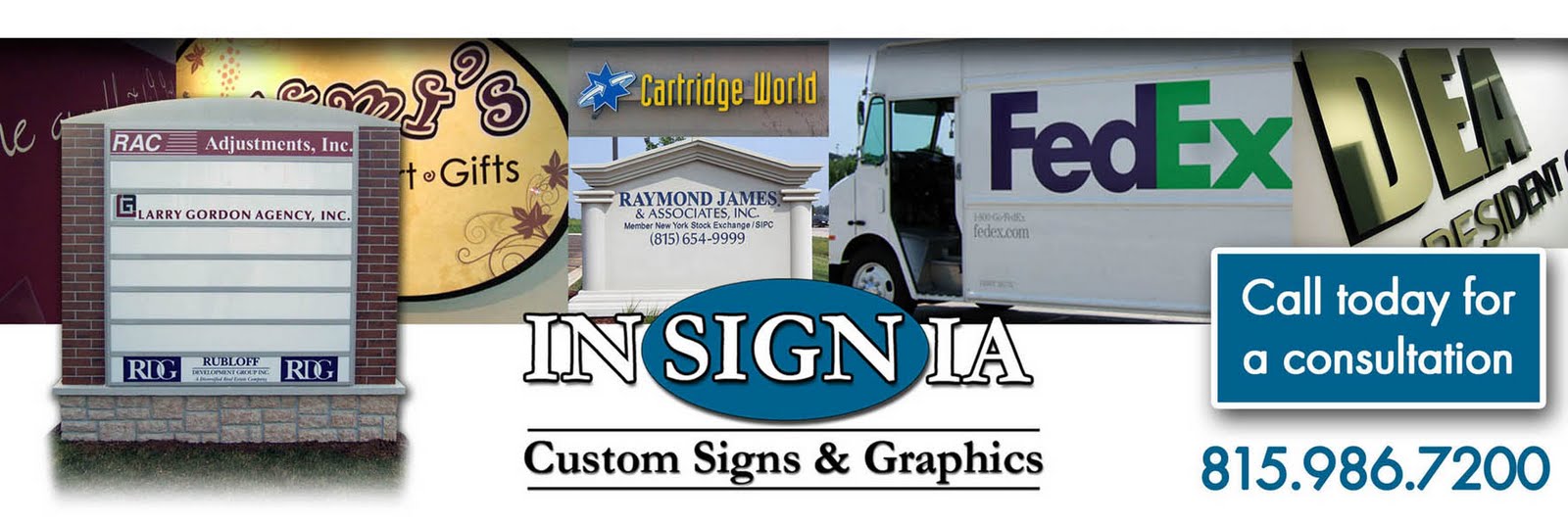
I'm talking about signs.
The concept is hardly ground breaking, but that's why they're easily forgotten. Signs are cheap and easy, but best of all they work.
Consider:
1. As we discussed the need for an online document-storage system, a few of us suggested the same company. Why? We had seen a huge billboard on the freeway.
2. For each trade show where we exhibit, we print a special sign featuring our newest product and a special offer for attendees. The sign costs about $100 but dramatically increases the number of people who come to our booth.
3. My carpet cleaner parks his truck, his unmarked truck, in my driveway on a very busy street. For a few bucks, he could get a magnetic sign and let hundreds of potential customers see his name and phone number. No sign, no ad.
Signs come in all forms and sizes -- a billboard in Times Square, an awning over your restaurant's front door, the name of your construction company on the side of your truck, someone standing on a corner wildly waving a sign pointing to your furniture store.
They can be inside or outside your place of business -- a banner printed at a copy shop announcing a blow-out sale or a hand-printed sign on a "staff favorites" shelf at a book store.
Signs get people's attention.
Besides being pretty cheap, another advantage is that typically they're persistent -- unlike a TV or website ad that disappears in 30 seconds or a Facebook posting that gets pushed down within an hour.
Invest in them once, and they generally stay around a long time without social media's ever-present need to update. Once you design the sign, you may not have to think about it for years.
When considering signs for your business, carefully consider what they'll look like and where you'll place them:
-- Keep the colors, type style, logo, and tagline consistent with all your other corporate identity and branding.
-- Make your message very brief, perhaps as few as seven to 10 words, as they'll have to be understood quickly
-- Use type large enough to be seen from the street or further away if necessary.
-- Make sure your signs are visible to people coming from every direction whenever possible.
-- Use high-contrast colors. Black text on a yellow background is considered the most readable combination, followed by black text on white, and white on black.
-- Keep your sign distinctive from its surroundings. If the sign will be surrounded by trees, avoid using too much green. Also try to make your sign different in shape, size, and style from other signs around it.
-- Make sure your sign is well illuminated if it needs to be seen at night.
Just because a location seems like a great place for a sign doesn't mean you can put your sign there.
Even at your own place of business, it's likely that your city or town has regulations strictly limiting the size and nature of the sign you can put up -- how large, whether it can have lighting, at what hours, and so forth.
It's also illegal to post signs or posters in most public locations or on others' private property. And you can't just put up a poster at a bus stop. You have to pay the transit authority for that privilege.
Rhonda Abrams is president of The Planning Shop and publisher of books for entrepreneurs. Her newest is the 5th edition of The Successful Business Plan: Secrets and Strategies. Register for Rhonda's free newsletter at www.PlanningShop.com and "like" The Planning Shop on Facebook for updates. See an index of Abrams' columns.Twitter: twitter.com/RhondaAbrams. Copyright Rhonda Abrams 2011.

6.02.2011

How To Increase Restaurant Visibility Despite Restrictive Sign Codes

A GREAT article for my restaurant clients!

~Amy Donahue
signage consultant

How To Increase Restaurant Visibility Despite Restrictive Sign Codes

Does it seem your city is working against your restaurant marketing efforts by imposing restrictive sign codes? Gone are the days of putting up a 50 foot tall pole sign with flashing strobe lights. Now in many jurisdictions it's all about small, low and non-obtrusive. Isn't that working against the whole purpose of a sign in the first place? The good news is that there are ways to increase visibility while staying within (or pushing the boundaries) of your local sign code.

Here are some ideas to improve visibility and help your restaurant marketing. Some of these may require a temporary permit or city approval, but often it's good to operate under the theory that it's easier to receive forgiveness than permission.

• Window Clings - Your windows can provide a lot of area to advertise. With today's widespread availability of large format digital printing, it's easy to create and produce window signage. Printers can even print on a material that allows customers inside to still see out through the window.

• Banners - These can be created in any size, any color, with a variety of methods. Whether they're digitally printed in full color or are cut vinyl letters made by the local one hour sign shop, banners are easy to customize for any restaurant marketing purpose.

• Inflatables - These attract attention. From the large burger or milkshake on the roof of your building, to the dancing chef in the parking lot, these are fun and eye-catching.

• Yard Signs – This is as inexpensive and low-tech as you can get, but people will see them. Just like the politicians use, yard signs can raise awareness of your promotion or location.

• A-frame Signs - A-frame signs come in a variety of sizes, shapes and looks – some even have the ability to change the words and graphics. A-frames are very handy because you can put them out when you want, then carry them back in. For instance, if you offer a special on your slow days, you only put the sign out on those days.

• Light Pole Banners – There is hardware available that you can add to lightposts in your parking to hang decorative or promotional banners. You often see holiday decorations hung this way, but there’s no reason you can’t use this to your advantage all year around.

• Wind Sails - These have become popular attention grabbers. You can have them printed with your logo or promo, then either stick the holder into the ground or use a weighted base to set them on a hard surface. They are available in multiple heights, with some sails going as high as 20 feet.

• Building Façade – If you look at trends in modern restaurant construction, you’ll notice many chains are now adding a tall tower entrance to their buildings. This tall architectural feature is actually part of the restaurant marketing strategy. That small sign you’re allowed to hang for your business is much more visible when it’s mounted at the top of a tower.

• Murals – Sometimes the best visibility is on someone else’s property. Is there a building down the street where you could paint a directional sign – “Dave’s Deli – Two Blocks Right”? Think of all the old barns throughout the country with Mail Pouch painted on them. That wasn’t to create a historic rustic look for those barns, they were advertising murals.

• Company Vehicle – Do you have a delivery van or company vehicle wrapped in signage? Simply park this at the end of your parking lot by a busy street, and it will act as extra signage – no sign permit required!

• Costumed Character – If you have a mascot or a costumed character, they can stand out in front of your restaurant and wave at passing motorists.

• Sign Waver – This attention-grabbing method seems to have started with the furniture and liquidation sale industry. People are hired (presumably at minimum wage) to stand with signs on busy streets and attract the attention of drivers. Often these people spin the signs and dance around either to be entertaining, or because it’s an incredibly boring job!

• Flag Pole – In most cities a flag pole does not fall under sign codes. You can install a tall flag pole that will help attract attention for you. Supercharge your flag pole by flying the American flag on top, and then a flag with your logo underneath it.

Read more: http://foodservicenews.com/articles/restaurant-marketing/how-to-increase-restaurant-visibility-despite-restrictive-sign-codes-8738/#ixzz1O9Fep5nI

5.11.2011

A great article from FastCompany

Aiming To Become Iconic, A Houston Museum Morphs Its Building Into A Logo

The new logo is both bold and cost effective, using design-world standards to maximum effect.
The Guggenheim Bilbao, San Francisco’s DeYoung, New York’s Whitney -- all are museums that have identities inextricably linked to their buildings and the architects who gave them shape (Frank Gehry, Herzog & deMeuron, and Marcel Breuer, respectively). You may know squat about art, but odds are you can pick Frank Lloyd Wright’s iconic Guggenheim out of a lineup. Can you say the same of the Contemporary Arts Museum Houston? Unless you live in Houston, probably not. That isn’t stopping the CAMH from trying to remix the building, as the basis for its rebranding campaign.
CAMH-3
Although it never made it into the architectural cannon, the stainless-steel-clad structure, designed by Latvian-born Gunnar Birkerts in 1972, is a standout work, especially for Houston. (Birkerts, the father of the literary critic Sven Birkerts, is better known for the Federal Reserve Bank of Minneapolis, 1973, and the Kemper Museum of Contemporary Art, in Kansas City, 1994.) Various views of the building yield four distinctive geometric shapes, which the New York-based firm AHL&CO layered on top of each other like a CMYK collage. (The previous logo was a flat, literal representation of the museum.) The mark can be used separately or in combination with the acronym in Helvetica Bold and all caps.
Detractors immediately seized on the logo when it began making the rounds on the Interweb, slamming it for the color palette (unimaginative!) and the typeface (Helvetica? Snore.). The designers answer their critics thusly: “In terms of the Helvetica and CMYK -- it was a simple matter of economy,” Peter Ahlberg writes in an email. “That meant there was no budget for new/customized type, spot color, etc. We felt that Helvetica Bold was malleable enough to accommodate any art (style, medium, etc.) paired with it.”
CAMH
CAMH-2
We’ll leave it to the graphic designers to debate the finer points. Regardless of the logo's merits, we applaud the museum’s appreciation of its home, even if it hasn’t achieved landmark status. And the mark just may encourage people to investigate their built environment from all angles, and there’s no downside to that.
http://www.fastcodesign.com/1663799/camh-logo

4.08.2011

I love Jelly Belly! Can't wait to see these signs!


MONDAY APRIL 4, 2011

Jelly Belly Offers Neon Logo Signs

Fairfield, CA — Retailers can purchase new neon signs from Jelly Belly Candy Co., featuring the company’s red and yellow logo.
The supplier says retailers can hang the Jelly Belly signs in store windows to signal shoppers that they stock the brand. Each sign is set against a black backdrop and can be attached to a neon yellow “Open” sign, also available from the company.
The signs are 18” long and 11” tall, and are available for shipment now, according to Jelly Belly.

3.11.2011

Pop-up retail gains favor in D.C. with Garment District

I love to see articles on how other cities are working to develop their commercial properties and expand businesses. Here's a first hand account of how small businesses are developing in D.C. A shout out to the Rockford City Market for starting our own "pop-up" store! I've found some awesome goodies every time I've gone!

~Amy Donahue


There was no certainty that the Temporium, a temporary "pop-up" retail boutique featuring 17 local designers, would take off when it launched in July at 13th and H streets NE.
Not only did it, well, pop up during the dog days of summer, one of the slowest sales periods for retail, but the concept of opening a store for a few weeks was pretty much unheard of in these parts. Over four weekends, however, the Temporium welcomed 1,616 visitors and pocketed $11,427 in sales after taxes.
That success has spawned two more temporary stores now open in the Mount Pleasant and Shaw neighborhoods of the District. Like their predecessor, the new boutiques are an outgrowth of the D.C. Office of Planning's Temporary Urbanism initiative to transform vacant commercial space into lively destinations that highlight the retail potential in emerging neighborhoods.
Though sales tax revenue is the only direct economic benefit for the city, Tanya Washington, chief of staff at the Office of Planning, considers the project a "win-win for everybody."
"It's activating these vacant spaces, bringing potential customers to the other businesses located near the Temporiums, and it's a great venue for artists and designers to display their work," she said.
The city awarded Mount Pleasant Main Street and Shaw Main Streets, nonprofit commercial revitalization groups, $15,000 a piece. Artisans must contribute 15 to 20 percent of their earnings, which is pooled with the grant money, to operate the stores.
About 40 designers and artists are featured at the Garment District, the Shaw store, at 1005 Seventh St. NW. The 10,000-square-foot space, owned by developer Douglas Jemal, has been used as campaign headquarters for D.C. Council member Jack Evans and former mayor Anthony Williams.
"Hopefully, there will be a restaurateur or retailer that will see the space in use and realize that it would be a great location for a business," said Alexander M. Padro, executive director of Shaw Main Streets. "As is, this is a vibrant corridor."
Padro partnered with Singa, a design training program in the District, to find vendors. To drum up interest, the organizers are offering more than two dozen free sewing classes until the store closes March 20. Local bands such as Cigarbox Planetarium will also perform.
Organizers of the Mount Pleasant Temporium, at 3068 Mount Pleasant St. NW, also have a full roster of events to draw visitors, including a series of storytelling events hosted by SpeakeasyDC and workshops run by Hello Craft.
At 900 square feet, the store, featuring 34 vendors, is a fraction of the size of its counterpart. Still, the boutique, scheduled to run through Sunday, rustled up some 2,000 visitors in its first weekend of operation.
At this rate, project manager Jessica Scheuerman anticipates the store will surpass the sales at the H Street Temporium. Scheuerman, who wrote the grant proposal as the economic development chair of Mount Pleasant Main Street, said the store reached its projected sales goal, which she would not disclose, within the first 10 days of operation.
That kind of public response is more than Philippa P.B. Hughes, founder of the Pink Line Project, envisioned in championing the Temporium concept and launching the H Street site.
A local cultural maven, Hughes aimed to create a viable business model for artisans to sell their wares, expand their brands and get new customers.
Thanks to the retail project, designer Dana Ayanna Greaves of Artistic Aya was inspired to open her own store in Georgetown.
"People are energized by doing these temporary, cool, creative projects," Hughes said. "It spurs interest and gets people thinking about what's out there. All of these things contribute to economic development."

By Danielle Douglas Sunday, March 6, 2011; 5:47 PM Capital Business Staff Writer

2.26.2011

Cities, counties expect big expense for sign changes

As much as the business is good for the companies fabricating these signs, it does not seem to be the right time to try to push this kind change through (and with such a small deadline). I agree certain directional signs need to be made larger and more visible, but forcing small cities in particular to have to change all the signs within such a short period of time? And from the federal government? A more gradual phase out of the older style signs should be included... if any changes now at all...

~Amy Donahue

Cities, counties expect big expense for sign changes

WASHINGTON — Set aside the funding issues. For St. Cloud Mayor Dave Kleis, new federal requirements regarding road signs are just another example of Washington impinging upon the province of local government.

“For the federal government to tell us how large the letters should be on our street signs is ridiculous,” Kleis said. “I don’t think that’s the role of the federal government.”
Yet, for Siobhan Kathleen Brady of Woodbury and dozens like her nationwide, the rules aimed at making road signs more visible can’t be implemented quick enough.
“I’m getting to an age where it is a little harder to see at night,” Brady said in an online comment on the issue. “Bright signs do help me see better and know where I am going; when to turn, for example.”
Such a divide poses a dilemma for the Federal Highway Administration as it culls through hundreds of comments on the agency’s compliance dates for traffic control regulations that range from crosswalk timing to road sign reflectivity. The guidelines, contained in the Manual on Uniform Traffic Control Devices, include replacing all street-name signs that are in uppercase letters with signs that are in uppercase and lowercase.
The FHWA, as the agency is known, will have to decide in effect whether to side with public officials or private citizens on its timetable, but comments by U.S. Transportation Secretary Ray LaHood may provide a clue to which way the agency will lean.
“I believe that this regulation makes no sense,” LaHood said in a Nov. 30 statement. “It does not properly take into account the high costs that local governments would have to bear. States, cities and towns should not be required to spend money that they don’t have to replace perfectly good traffic signs.”
Along with his statement, the secretary opened a new 45-day public comment period. The issue drew more than 550 responses before the period closed Jan. 14. More than two dozen Minnesotans commented, including some members of the Minnesota Association of Townships.
At issue are the compliance deadlines for the regulations, which were enacted under the George W. Bush administration. The FHWA wants all jurisdictions to have a plan by January 2012 for evaluating and replacing street signs. By January 2015, warning and ground-level guide signs must meet federal reflectivity standards. And by 2018, overhead guide signs and non-compliant street signs must meet those standards. There is no deadline for the lettering on street-name signs.

Safety, costs
The heart of the issue is public safety, and it comes on the cusp of a sizable increase in the population of older Americans as the first wave of baby boomers reach age 65 in 2011. The number of licensed drivers older than 65 will reach 57 million by 2030, according to the National Highway Traffic Safety Administration. In 2008, older people accounted for 15 percent of traffic fatalities and 18 percent of pedestrian fatalities, according to the agency.
Public works officials say they are all for safety, but they balk that the regulations are an unfunded mandate at a time when local governments are struggling to take care of the basics.
“We have significant budget issues, and our priority is to make sure cops are on the streets,” said Kleis, who estimated the cost of complying with road sign regulations would run “several hundred thousand dollars.”
The financial strain is particularly onerous for smaller communities.
“The impact of the new sign program will hit the public on so many levels because it affects safety signs, road signs and even those in the parking lots of our favorite shopping areas and malls,” said Eugene Dufault, special-programs coordinator for the Minnesota Association of Townships. “The cost will be enormous for those entities that have not or haven’t been able to keep up the sign replacement.”

Seeking flexibility
Such concern stirred Sen. Al Franken to urge the FHWA to give states and local communities more leeway in meeting the requirements.
“At minimum, FHWA should provide more flexibility in meeting the 2018 deadline and make additional funds available to assist local governments with the costs of meeting these requirements,” Franken said in a Jan. 10 letter to FHWA Administrator Victor Mendez.
Franken’s letter said the Minnesota Department of Transportation estimates the cost of meeting the requirements would be $55 million to $76 million statewide. That figure is derived from the state’s estimate of costs for typical townships, cities under 5,000 population, cities over 5,000 population and counties.

For example, the typical township has about 30 miles of roadway with an average of six traffic signs per mile. The average to replace each sign would be $150. The annual replacement cost to meet the 2015 deadline for all warning and ground level signs would be $5,400. For small cities, it would be $65,000. For larger cities, the annual cost would be $260,00, and for counties it would be $400,000.
The city of Minneapolis estimates complying with the sign reflectivity requirements would cost more than $5 million during the next four to seven years, as half of the city’s nearly 100,000 signs would have to be replaced.
“A realistic goal for sign reflectivity is to consider existing documented maintenance programs in correlation with the characteristics of the roadway ... and limit the program requirements to what the local authorities deem as priorities,” city engineer Steven Kotke said in a Jan. 11 comment.
In a Jan. 11 comment, the National Association of County Engineers urged the FHWA to allow state and local governments to replace signs as they wear out, rather than on the agency’s schedule. The NACE said the agency’s new Manual on Uniform Traffic Devices strips the ability of local and state road experts to “exercise engineering judgment” on when to replace signs.
“That dilution of the authority of state and local agencies does not advance safety but does pile costs on the backs of state and local governments,” the engineers group said.
Those costs are small when measured against the public safety value of the new sign regulations, say many of those who commented on the issue.
“The economic benefits of replacing noncompliant signs outweigh the economic losses that will be incurred,” wrote Gerald Bauer of Woodbury on Jan. 11, citing insurance claims, emergency responses and court action stemming from roadside accidents. “This is one of those instances where we need to be proactive and set a deadline and hold ourselves to it to prevent more economical loss than what it takes to prevent the loss.”
Dufault said local communities need more time to adjust their budget priorities. He, too, called for a more flexible schedule while recognizing that public safety is a shared goal.
“Safety is a big concern for all governments large and small, and I think everyone wants to be responsible and responsive,” Dufault said, “but this is an unfunded mandate in a time when everyone is strapped.”

By Larry Bivins • Times Washington correspondent • February 21, 2011

2.22.2011

ADA Signage - Restroom / Hand Washing Signs

The Americans with Disabilities Act (ADA) requires building standards that make it possible for those with disabilities to use public facilities safely. The ADA encompasses many different areas of building design. One important area that it covers is signage. Signage is an important part of ADA because it helps to identify areas, rooms, and paths of travel that make it possible for those with disabilities to use the building. Restroom signage is important, especially in buildings that may not have accessible restrooms. Signs help to identify those restrooms that are accessible.

Options for Restroom Signs:

  • ADA Braille - Laser-engraved acrylic restroom identification signs in various color combinations.
  • Printed, Multi-Mount - Printed on a variety of materials, options include surface-mount signs and signs that stand out from the wall or ceiling for increased visibility. Standard, designer and premium colors match our engraved acrylic signs.
  • California Title 24 Sets - California has specific rules for restroom signs, and we've got the signs you need to meet the requirements. Door / wall sets and individual signs and symbols are available in standard, designer and premium colors.
  • Engraved Office Signs - Available in 2 sizes, 9 colors, with or without symbols, and with your choice of silver- or gold-finish wall brackets.
  • Sliding Signs - These engraved acrylic signs slide left and right in a metal bracket to indicate the status of the room: (Men / Women; Occupied / Vacant). Available in 9 colors.
  • Tactile Braille - These slightly enlarged versions of our Office Signs include Grade 2 Braille and a matte finish. Choose from 22 color combinations.
  • Informational Signs - Check this page to find baby changing signs, hygiene reminders and more.
Options for Hand Washing Signs:
  • Instructions - These printed signs use words and symbols to show proper hand washing techniques.
  • OSHA and ANSI - Notice, Warning and other headers can help prevent contamination and injury in the workplace.
  • Engraved - Various color combination's to identify hand washing facilities and remind employees to wash up.
  • Engraved, Braille - Various color combination's in ADA and office styles.
  • Clear Labels - These adhesive-backed clear labels work great on mirrors and chrome surfaces.
  • Child-Friendly - These signs with bright colors and fun designs are sure to appeal to kids - and help teach them good hand washing habits.
  • Plaques and Frames - If your restrooms deserve a designer touch, look through our collection of signs with wood frame and plaque options, or choose a brushed metal finish.
Insignia is your one stop shop for all your ADA signage needs. We can customize your signs to work aesthetically with your decor and even design architectural elements into your signage. Call today for a free consultation!