
The new logo is both bold and cost effective, using design-world standards to maximum effect.
The Guggenheim Bilbao, San Francisco’s DeYoung, New York’s Whitney -- all are museums that have identities inextricably linked to their buildings and the architects who gave them shape (Frank Gehry, Herzog & deMeuron, and Marcel Breuer, respectively). You may know squat about art, but odds are you can pick Frank Lloyd Wright’s iconic Guggenheim out of a lineup. Can you say the same of the Contemporary Arts Museum Houston? Unless you live in Houston, probably not. That isn’t stopping the CAMH from trying to remix the building, as the basis for its rebranding campaign.
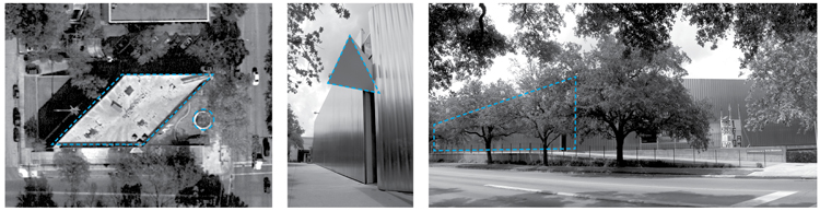
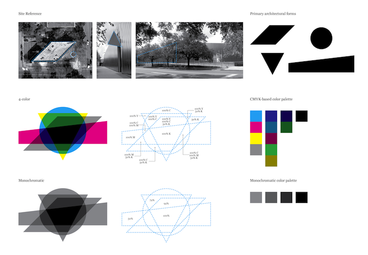
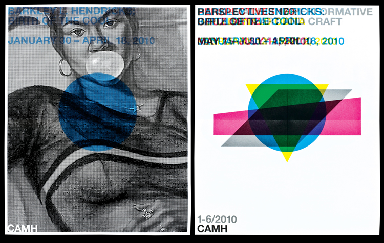
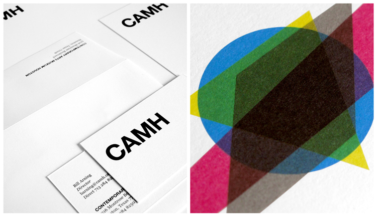
Although it never made it into the architectural cannon, the stainless-steel-clad structure, designed by Latvian-born Gunnar Birkerts in 1972, is a standout work, especially for Houston. (Birkerts, the father of the literary critic Sven Birkerts, is better known for the Federal Reserve Bank of Minneapolis, 1973, and the Kemper Museum of Contemporary Art, in Kansas City, 1994.) Various views of the building yield four distinctive geometric shapes, which the New York-based firm AHL&CO layered on top of each other like a CMYK collage. (The previous logo was a flat, literal representation of the museum.) The mark can be used separately or in combination with the acronym in Helvetica Bold and all caps.
Detractors immediately seized on the logo when it began making the rounds on the Interweb, slamming it for the color palette (unimaginative!) and the typeface (Helvetica? Snore.). The designers answer their critics thusly: “In terms of the Helvetica and CMYK -- it was a simple matter of economy,” Peter Ahlberg writes in an email. “That meant there was no budget for new/customized type, spot color, etc. We felt that Helvetica Bold was malleable enough to accommodate any art (style, medium, etc.) paired with it.”
We’ll leave it to the graphic designers to debate the finer points. Regardless of the logo's merits, we applaud the museum’s appreciation of its home, even if it hasn’t achieved landmark status. And the mark just may encourage people to investigate their built environment from all angles, and there’s no downside to that.
http://www.fastcodesign.com/1663799/camh-logo